 In the early days of the Internet, one of the biggest attractions was the fact that absolutely anybody was able to sign up for a free email account, and with it get their very own webpage. No design experience whatsoever was required for this… and it showed. Gaudy was vogue, and if you doubt me spend some time on the Internet Archive to see what I am referring to. With continued ease of use and the advent of cheap hosting, this trend continues even today. However, fortunately for those of us who are in fact design-challenged (and yes, in general I do include myself amongst the masses when it comes to a lack of graphic arts talent) in modern times we have leaders in the industry we can emulate when we want to learn how things should be done. Today let us turn to one of the Internet giants for our lessons in usability, to none other than Digg.com itself.
Lesson 1: Abandon Using Tables For Layouts
In today’s Web 2.0 environment care should be taken to keep the content separate from the layout. Digg accomplishes this nicely, using only tags such as div and lists within the content itself, and then positioning everything using external stylesheets. If you’ve tried to tackle CSS before, and found it daunting, I would suggest perhaps that instead of working from scratch you start with either one of the CSS driven templates from Open Source Web Design, or grab one of the basic layouts offered at Strictly CSS, as I find they lend themselves nicely to customizations. I would also recommend bookmarking both W3Schools CSS Reference and the CSS Cheat Sheet, and using them whenever you get stuck.
Lesson 2: Pick Colors That Actually Do Match
Digg has a nice soft color scheme that is very easy on the eyes:

If you don’t have the necessary skills needed to decide which colors actually go together, there are some tools out there that can actually assist you with this. While you might eventually get what you are looking for with basic trial and error, it is much faster to pop over to the Online Color Scheme Generator at ColorSchemer.com, or the Color Scheme Generator 2 by WellStyled, and let them do the work for you.
Lesson 3: Easy Navigation
Being able to find what you need on a site is crucial to its success, and Digg does a great job of making this as easy as possible for its users. The bulk of Digg content is found within the various categories in which the news stories are submitted. Each of these categories can easily be reached with Digg’s 2 layer horizontal navigation bar found right up in the header. Immediately above the navigation are both the search box, and an AJAX driven login form. Since these header elements are found universally on the entire site, users can get to where they need to be within just a few click, regardless of which page it is that they initially land on. For those of you interested in learning how to build horizontal tabbed navigation using CSS for yourselves, I suggest Vitaly Friedman’s CSS Showcase to get you started.
Lesson 4: Smart Usage Of Footer Real Estate
The bottom of every Digg page is not wasted either:

(click to enlarge)
While lesser used than the top navigation, the footer in Digg’s case does contain important links that are good to have handy, just in case you need them, such as to the About Us and Contact pages. With such a huge fan base, it makes sense that they would put a link to the Digg Store on every page as well. Also found here are paths to reach the Blog, Job Offerings, and information for those wishing to advertise on Digg itself.
Lesson 5: Finally, Fuck The Whole Thing Up By Sticking A Vertical Skyscraper In Your Horizontal Ad Slot
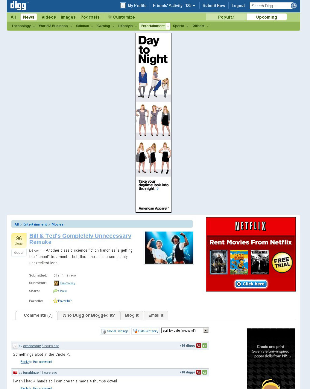
(click to enlarge)
I mean… WTF??
Hehe, classic! I actually just saw this happening yesterday on another site too, so I wonder if it’s a Google thing messing it up (that’s a G ad on Digg too right?). The other site still continued to display normally though as the content just sat ‘over’ the banner.
LOL. That’s awesome! One of the funniest posts I’ve read in a while. 🙂
Laughed so hard my sides hurt. Had to compose myself just to make this reply. Great post!
LOL nice one! Finding the right ad spot can be kinda tricky 😀
As long as the content is sincere and entertaining, I usually don’t give a crap about the look and feel. Blog software makes most non techie sites look usable enough. Thanks for the CSS links, working on custom templates is making my eyes bleed!